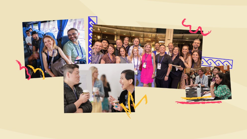
Belief. Belong. Beyond. × EO
Cultural research, narrative strategy, creative direction, and website copy for EO's Global Leadership Conference, bringing 1,600+ member entrepreneurs to Honolulu.
The Challenge
EO already knew how to fill a room. Honolulu asked something more of the invitation.
Entrepreneurs' Organization asked me to build the narrative for the 28th Global Leadership Conference, held April 3–5, 2025 at the Hawaiʻi Convention Center in Honolulu. I'd just come off doing the same job for GLC Singapore the year before, so I understood the mechanics of a global event site: make it legible, make it compelling, make travel feel worth deciding on. Honolulu asked for something those mechanics alone couldn't give it. Before I could write a word of homepage copy, I had to learn a place closely enough that the members flying in would arrive as guests, not tourists.
The responsibility underneath the invitation
What that meant, in practice
The Insight
ʻOhana gets reduced to family so often that the word stops doing its real work.
The narrative needed to carry something fuller than the dictionary translation: interconnectedness, shared responsibility, collective strength, a real commitment to make room for every voice in the room. That fuller definition, not the postcard version, became the spine the rest of the site's copy had to hold up.
The Idea
Working alongside EO's Learning team and the EO Honolulu chapter, I moved through interviews and research before a single headline existed: local history, values, language, the visual symbols and flowers that actually mean something here, and how land, ocean, ancestors, and community relate to one another in ways a mainland assumption would never guess at. Some of that research reached the page directly. More of it just kept the project from getting Hawaiʻi wrong.
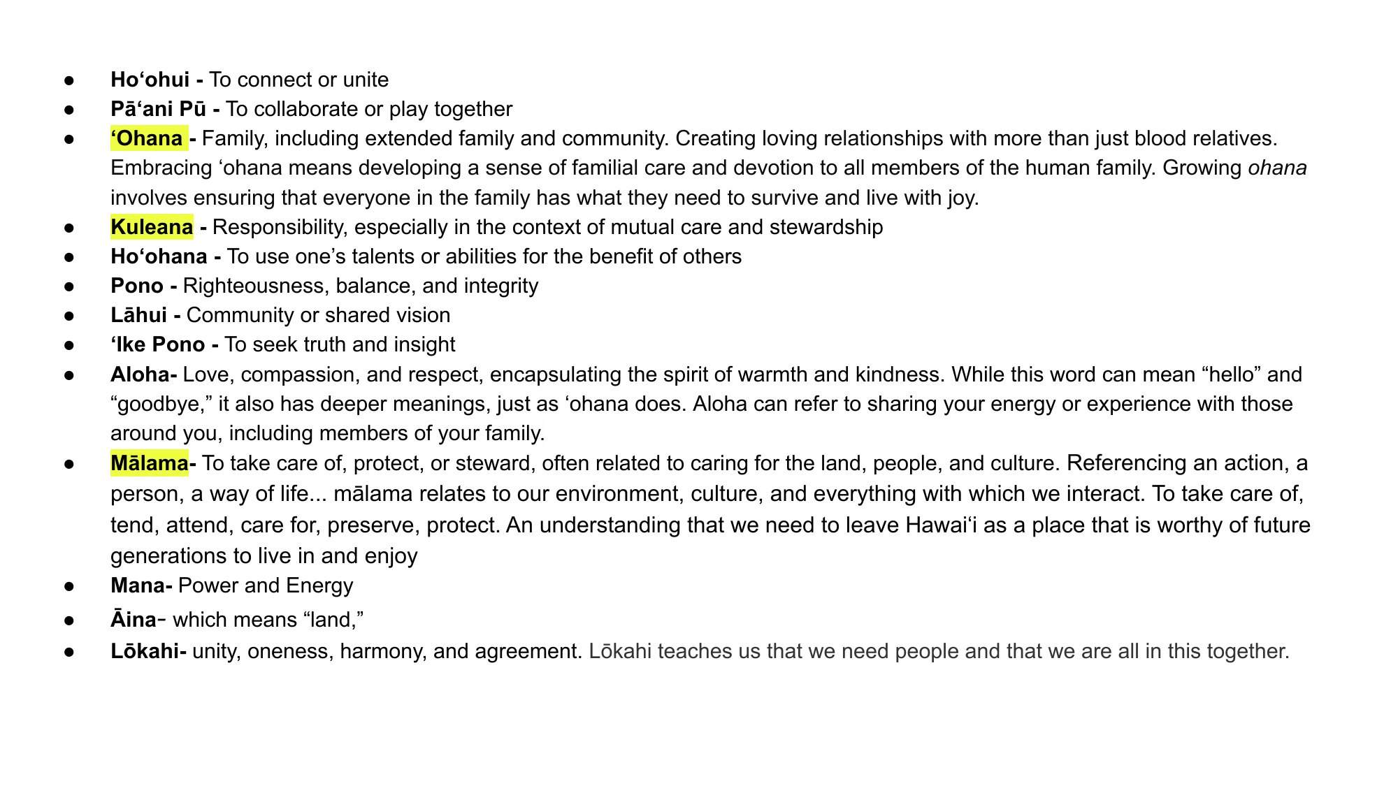
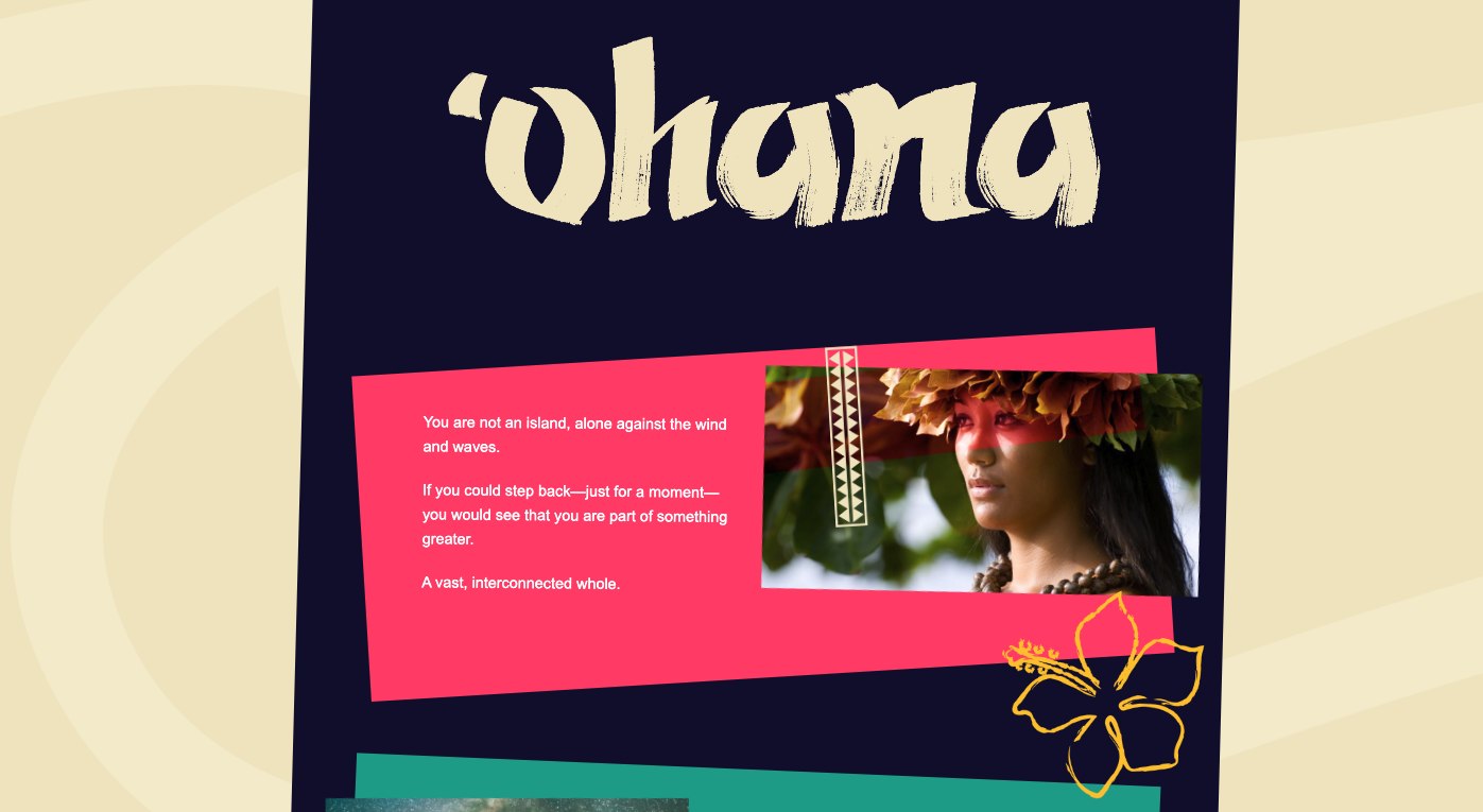
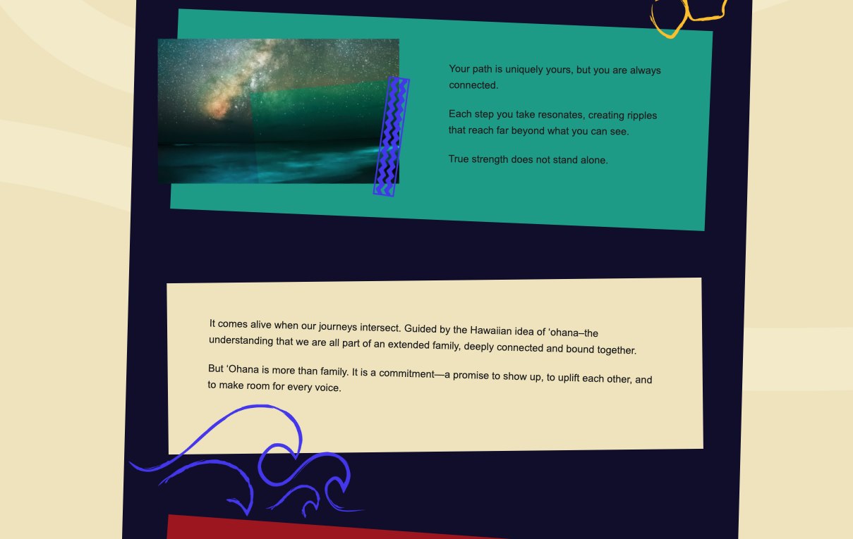
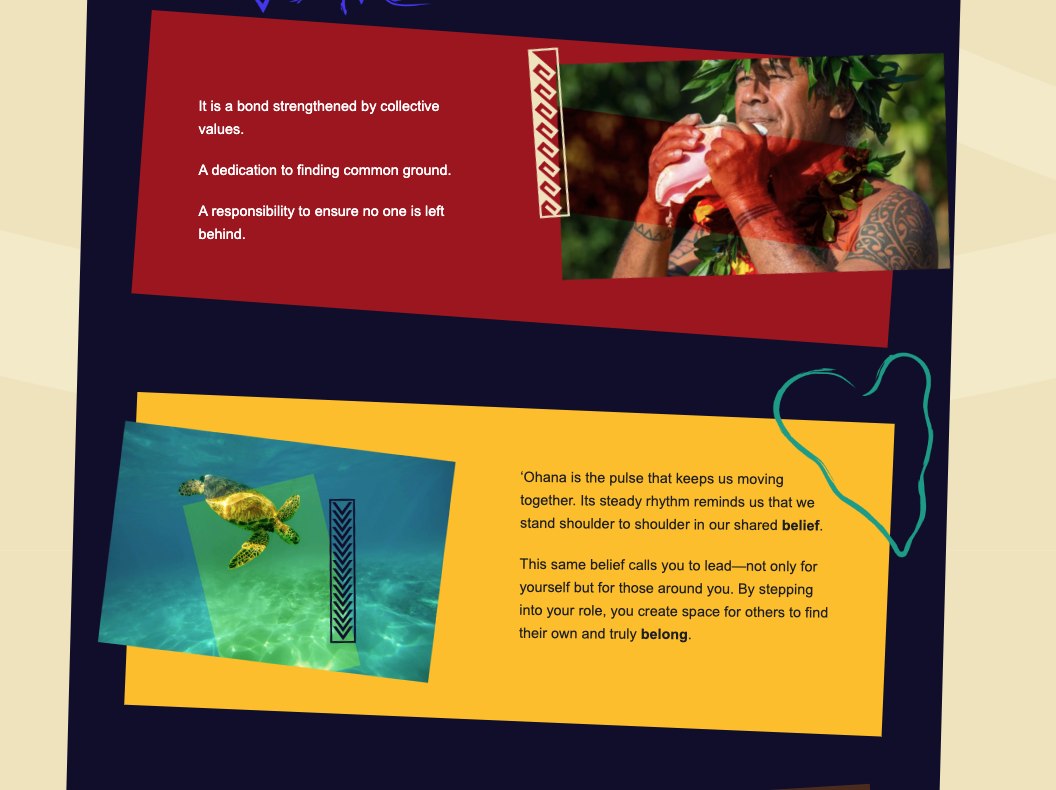
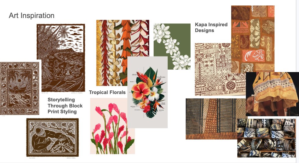
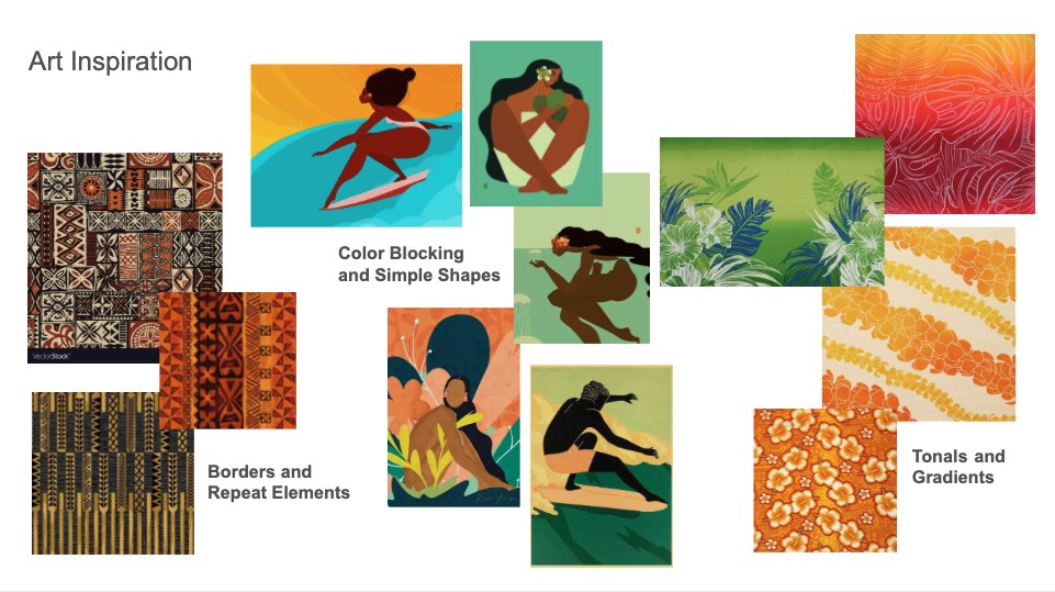
That research became a real narrative sequence in the deck before it ever became homepage copy, block-print-inspired patterns, tropical florals, kapa-inspired motifs, and real Hawaiian photography, not a stock tropical kit. The throughline below is the same one that later shaped the site: you are not alone, your path still connects to everyone else's, and ʻOhana is a responsibility as much as a feeling.
From Idea to System
Color, mood, and art direction got the same treatment as the words: co-developed with my creative director, built from real Hawaiian photography and pattern work instead of a stock tropical palette dropped in at the end.
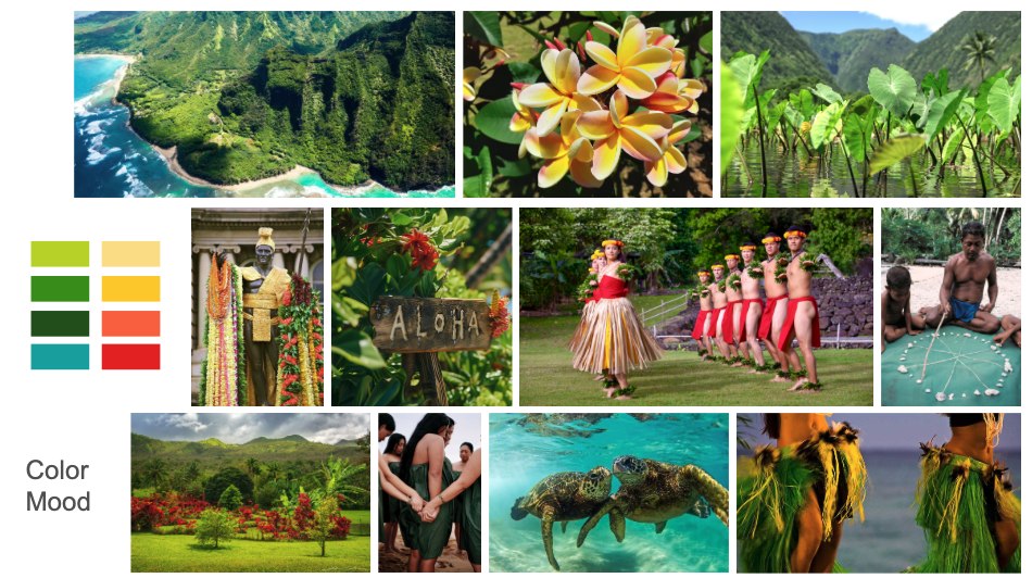
The mood board the palette actually came from, coastline, plumeria, taro, and lei-making alongside the swatches they produced. That palette is what ended up in the pattern strips and learning-block icons on the live site.
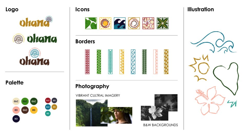
Where the research became a working system: logo lockup options, an icon set, border patterns, and an illustration style, all pulled from the same references.
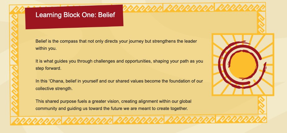
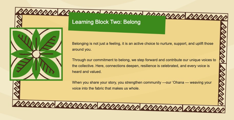
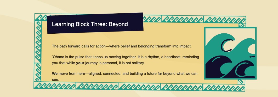
The same discipline shaped the words. The homepage had to move a reader through the same progression the conference itself was built around: start with the individual, widen to the community, end with what the community can do together. Each learning block carried a distinct piece of that argument, not three identical blocks stacked in a row, as it reads today on the live Learning Program page:
The Website
I worked wireframing and layout collaboratively with EO's Learning and Marketing teams, using the content hierarchy we'd already settled on: establish the ʻOhana narrative first, introduce Belief. Belong. Beyond., then give each learning block a distinct role in the larger story. I annotated those layouts directly, page by page, then handed the concept and copy to an outside development team to build. My job stopped at the blueprint. Theirs started at the build, and the site below is what came out of that handoff.
The live homepage hero, as it ships today.
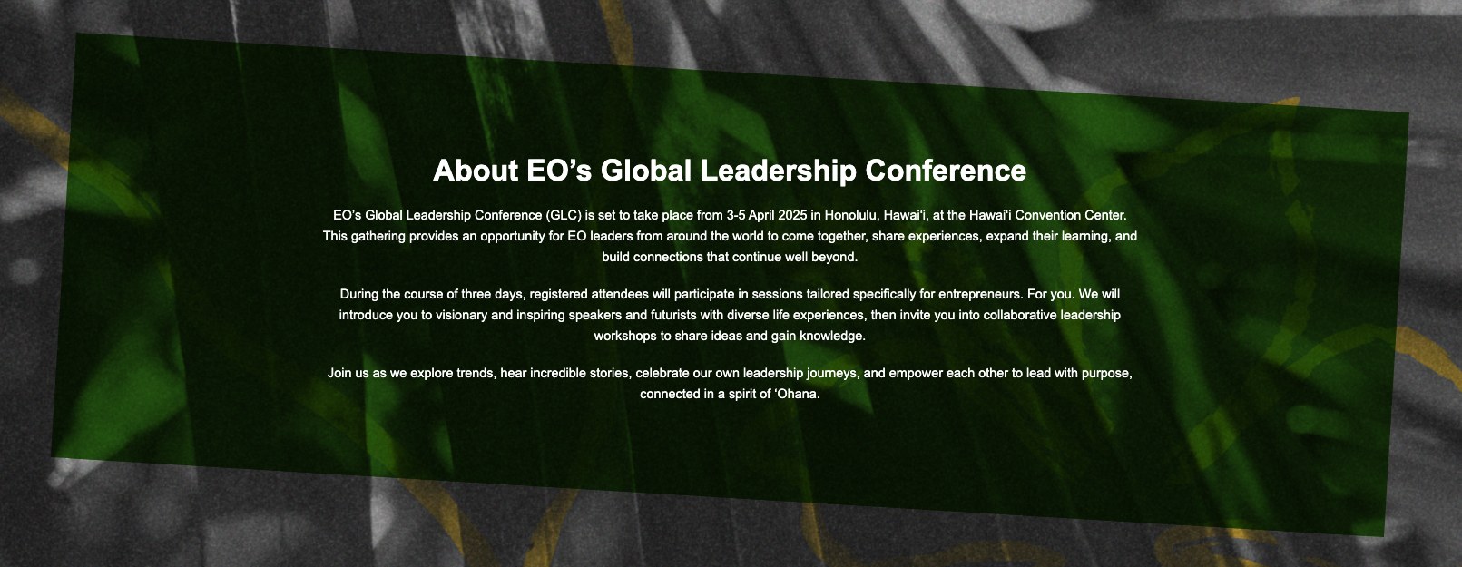
The About section, carrying the narrative from the hero into the case for attending.
event.eonetwork.org/2025glc · full homepage scroll and close-in pattern detail to come.
One Voice, Different Jobs
I wrote every page on the site, and the same voice had to do different work depending on where a reader landed: narrative on the homepage, clarity in the logistics, credibility in the speaker bios.
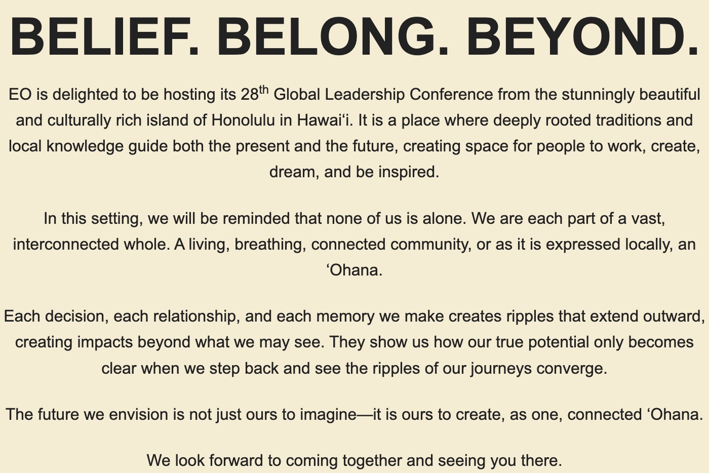
Opens with the individual, not the organization, and widens the aperture line by line, so the ask to travel doesn't land until the reader already feels part of something.
Excerpt from the live homepage, event.eonetwork.org/2025glc/.
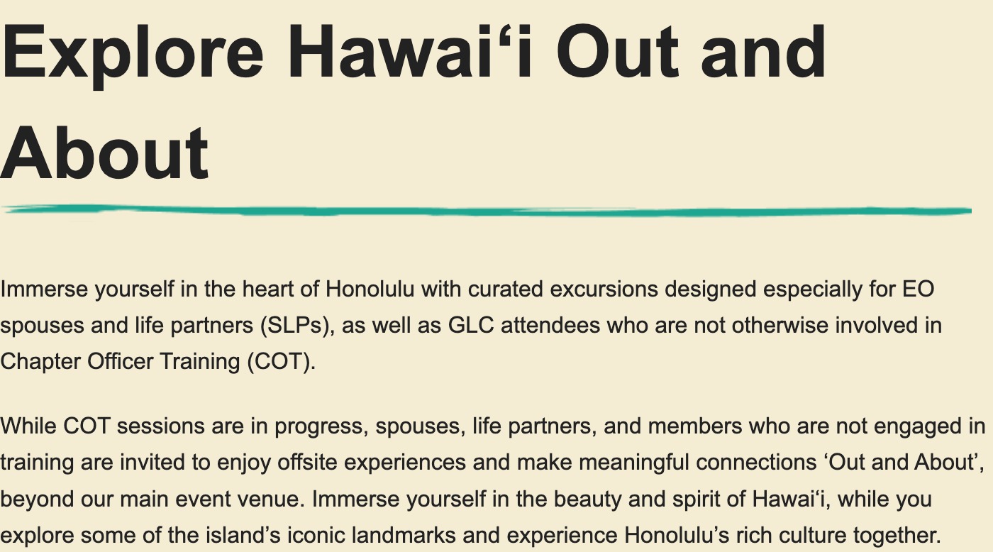
ʻOhana still shows up, but doing logistics work: it frames three ticketed excursions as connection, not just an activity list. Eligibility rules, non-refundable-but-transferable ticketing, and a no-bags policy at Pearl Harbor couldn't be lyrical. They had to be exact, because someone was making a purchase decision from them.
Excerpt from the live Out & About: ʻOhana page, event.eonetwork.org/2025glc/out-and-about-ohana/.
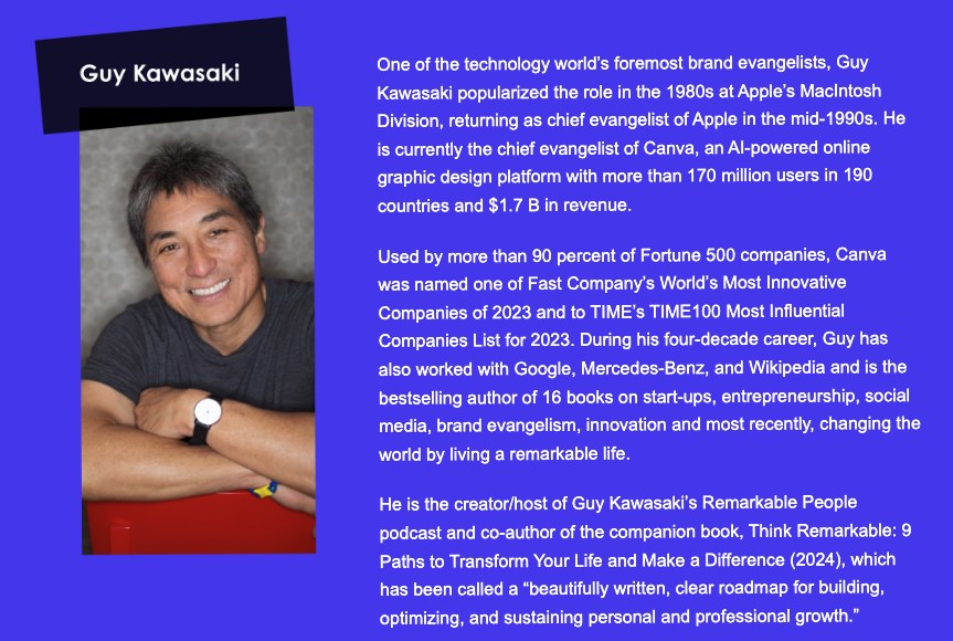
Career-defining fact first, current work second, concrete numbers standing in for the compliments a weaker bio would reach for, one template carried across every speaker on the roster, Guy Kawasaki's included.
Guy Kawasaki's speaker bio, event.eonetwork.org/2025glc/learning-program/.
What Shipped
A homepage built around ʻOhana's fuller meaning, not its dictionary one. A three-part learning architecture that gave Belief, Belong, and Beyond each their own job to do. A full site of secondary pages, from speaker bios to Out & About logistics, written in the same voice at different volumes. A color and pattern system pulled from the island itself, not a template. All of it built from research done before a single headline existed, and handed to a development team with wireframes annotated well enough to build without me in the room.
Sarah Buckholtz · Copywriter, Researcher & Narrative Strategist · Entrepreneurs' Organization